CSS实现各种Loading效果附带解析
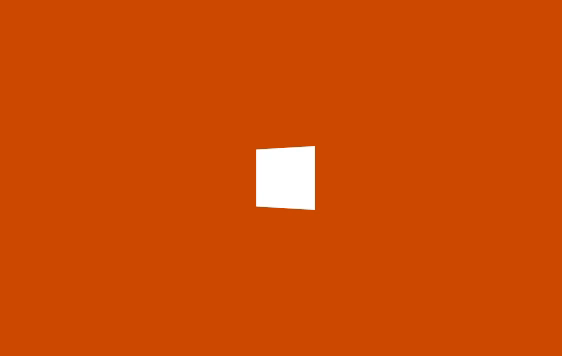
HTML
<div?class="spinner"></div>
CSS
.spinner?{
??width:?40px;
??height:?40px;
??background-color:?#333;

??margin:?100px?auto;
??-webkit-animation:?sk-rotateplane?1.2s?infinite?ease-in-out;
??animation:?sk-rotateplane?1.2s?infinite?ease-in-out;
}

@-webkit-keyframes?sk-rotateplane?{
??0%?{?-webkit-transform:?perspective(120px)?}
??50%?{?-webkit-transform:?perspective(120px)?rotateY(180deg)?}
??100%?{?-webkit-transform:?perspective(120px)?rotateY(180deg)??rotateX(180deg)?}
}

@keyframes?sk-rotateplane?{
??0%?{?
????transform:?perspective(120px)?rotateX(0deg)?rotateY(0deg);
????-webkit-transform:?perspective(120px)?rotateX(0deg)?rotateY(0deg)?
??}?50%?{?
????transform:?perspective(120px)?rotateX(-180.1deg)?rotateY(0deg);
????-webkit-transform:?perspective(120px)?rotateX(-180.1deg)?rotateY(0deg)?
??}?100%?{?
????transform:?perspective(120px)?rotateX(-180deg)?rotateY(-179.9deg);
????-webkit-transform:?perspective(120px)?rotateX(-180deg)?rotateY(-179.9deg);
??}
}
解析:定义一个?div?元素,设置边长为 40px 背景白色的正方形,然后设置循环翻转动画实现该加载效果动画
perspective 属性定义 3D 元素距视图的距离

HTML
<div?class="sk-chase">
??<div?class="sk-chase-dot"></div>
??<div?class="sk-chase-dot"></div>
??<div?class="sk-chase-dot"></div>
??<div?class="sk-chase-dot"></div>
??<div?class="sk-chase-dot"></div>
??<div?class="sk-chase-dot"></div>
</div>
CSS
.sk-chase?{
??width:?40px;
??height:?40px;
??position:?relative;
??animation:?sk-chase?2.5s?infinite?linear?both;
}

.sk-chase-dot?{
??width:?100%;
??height:?100%;
??position:?absolute;
??left:?0;
??top:?0;?
??animation:?sk-chase-dot?2.0s?infinite?ease-in-out?both;?
}

.sk-chase-dot:before?{
??content:?'';
??display:?block;
??width:?25%;
??height:?25%;
??background-color:?#fff;
??border-radius:?100%;
??animation:?sk-chase-dot-before?2.0s?infinite?ease-in-out?both;?
}

.sk-chase-dot:nth-child(1)?{?animation-delay:?-1.1s;?}
.sk-chase-dot:nth-child(2)?{?animation-delay:?-1.0s;?}
.sk-chase-dot:nth-child(3)?{?animation-delay:?-0.9s;?}
.sk-chase-dot:nth-child(4)?{?animation-delay:?-0.8s;?}
.sk-chase-dot:nth-child(5)?{?animation-delay:?-0.7s;?}
.sk-chase-dot:nth-child(6)?{?animation-delay:?-0.6s;?}
.sk-chase-dot:nth-child(1):before?{?animation-delay:?-1.1s;?}
.sk-chase-dot:nth-child(2):before?{?animation-delay:?-1.0s;?}
.sk-chase-dot:nth-child(3):before?{?animation-delay:?-0.9s;?}
.sk-chase-dot:nth-child(4):before?{?animation-delay:?-0.8s;?}
.sk-chase-dot:nth-child(5):before?{?animation-delay:?-0.7s;?}
.sk-chase-dot:nth-child(6):before?{?animation-delay:?-0.6s;?}

@keyframes?sk-chase?{
??100%?{?transform:?rotate(360deg);?}?
}

@keyframes?sk-chase-dot?{
??80%,?100%?{?transform:?rotate(360deg);?}?
}

@keyframes?sk-chase-dot-before?{
??50%?{
????transform:?scale(0.4);?
??}?100%,?0%?{
????transform:?scale(1.0);?
??}?
}
解析:定义一个父元素 div,内含六个白色实心圆点,添加旋转动画,通过设置不同的延迟时间来达到依次出现的效果

HTML
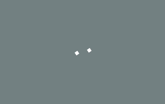
<div?class="spinner">
??<div?class="double-bounce1"></div>
??<div?class="double-bounce2"></div>
</div>
CSS
.spinner?{
??width:?40px;
??height:?40px;

??position:?relative;
??margin:?100px?auto;
}

.double-bounce1,?.double-bounce2?{
??width:?100%;
??height:?100%;
??border-radius:?50%;
??background-color:?#333;
??opacity:?0.6;
??position:?absolute;
??top:?0;
??left:?0;
??
??-webkit-animation:?sk-bounce?2.0s?infinite?ease-in-out;
??animation:?sk-bounce?2.0s?infinite?ease-in-out;
}

.double-bounce2?{
??-webkit-animation-delay:?-1.0s;
??animation-delay:?-1.0s;
}

@-webkit-keyframes?sk-bounce?{
??0%,?100%?{?-webkit-transform:?scale(0.0)?}
??50%?{?-webkit-transform:?scale(1.0)?}
}

@keyframes?sk-bounce?{
??0%,?100%?{?
????transform:?scale(0.0);
????-webkit-transform:?scale(0.0);
??}?50%?{?
????transform:?scale(1.0);
????-webkit-transform:?scale(1.0);
??}
}
解析:两个子元素 div 实现半透明的圆形,设置绝对定位重叠在一起,然后设置相同的动画通过不同的延迟时间交替放大缩小。

HTML
<div?class="spinner">
??<div?class="rect1"></div>
??<div?class="rect2"></div>
??<div?class="rect3"></div>
??<div?class="rect4"></div>
??<div?class="rect5"></div>
</div>
CSS
.spinner?{
??margin:?100px?auto;
??width:?50px;
??height:?40px;
??text-align:?center;
??font-size:?10px;
}

.spinner?>?div?{
??background-color:?#333;
??height:?100%;
??width:?6px;
??display:?inline-block;
??
??-webkit-animation:?sk-stretchdelay?1.2s?infinite?ease-in-out;
??animation:?sk-stretchdelay?1.2s?infinite?ease-in-out;
}

.spinner?.rect2?{
??-webkit-animation-delay:?-1.1s;
??animation-delay:?-1.1s;
}

.spinner?.rect3?{
??-webkit-animation-delay:?-1.0s;
??animation-delay:?-1.0s;
}

.spinner?.rect4?{
??-webkit-animation-delay:?-0.9s;
??animation-delay:?-0.9s;
}

.spinner?.rect5?{
??-webkit-animation-delay:?-0.8s;
??animation-delay:?-0.8s;
}

@-webkit-keyframes?sk-stretchdelay?{
??0%,?40%,?100%?{?-webkit-transform:?scaleY(0.4)?}??
??20%?{?-webkit-transform:?scaleY(1.0)?}
}

@keyframes?sk-stretchdelay?{
??0%,?40%,?100%?{?
????transform:?scaleY(0.4);
????-webkit-transform:?scaleY(0.4);
??}??20%?{?
????transform:?scaleY(1.0);
????-webkit-transform:?scaleY(1.0);
??}
}
解析:在类名为?spinner?元素下有五个 div 实现的长方形元素,设置Y轴的缩放,通过不同的延迟时间来达到依次变化的效果。
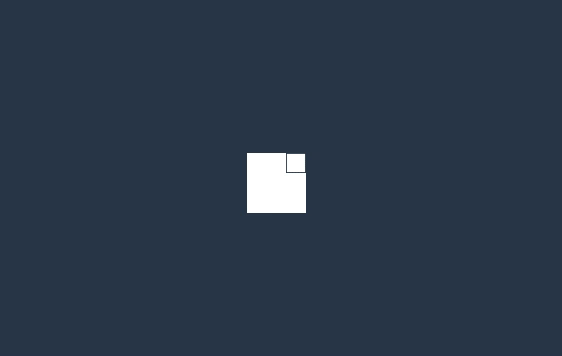
HTML
<div?class="spinner">
??<div?class="cube1"></div>
??<div?class="cube2"></div>
</div>
CSS
.cube1,?.cube2?{
??background-color:?#333;
??width:?15px;
??height:?15px;
??position:?absolute;
??top:?0;
??left:?0;
??
??-webkit-animation:?sk-cubemove?1.8s?infinite?ease-in-out;
??animation:?sk-cubemove?1.8s?infinite?ease-in-out;
}

.cube2?{
??-webkit-animation-delay:?-0.9s;
??animation-delay:?-0.9s;
}

@-webkit-keyframes?sk-cubemove?{
??25%?{?-webkit-transform:?translateX(42px)?rotate(-90deg)?scale(0.5)?}
??50%?{?-webkit-transform:?translateX(42px)?translateY(42px)?rotate(-180deg)?}
??75%?{?-webkit-transform:?translateX(0px)?translateY(42px)?rotate(-270deg)?scale(0.5)?}
??100%?{?-webkit-transform:?rotate(-360deg)?}
}

@keyframes?sk-cubemove?{
??25%?{?
????transform:?translateX(42px)?rotate(-90deg)?scale(0.5);
????-webkit-transform:?translateX(42px)?rotate(-90deg)?scale(0.5);
??}?50%?{?
????transform:?translateX(42px)?translateY(42px)?rotate(-179deg);
????-webkit-transform:?translateX(42px)?translateY(42px)?rotate(-179deg);
??}?50.1%?{?
????transform:?translateX(42px)?translateY(42px)?rotate(-180deg);
????-webkit-transform:?translateX(42px)?translateY(42px)?rotate(-180deg);
??}?75%?{?
????transform:?translateX(0px)?translateY(42px)?rotate(-270deg)?scale(0.5);
????-webkit-transform:?translateX(0px)?translateY(42px)?rotate(-270deg)?scale(0.5);
??}?100%?{?
????transform:?rotate(-360deg);
????-webkit-transform:?rotate(-360deg);
??}
}
解析:两个子元素实现白色的方块,添加动画属性,在X轴和Y轴分别设置移动距离和缩放,通过不同的延迟时间来分离他们,rorate?实现围绕中心旋转。

HTML
<div?class="spinner"></div>
CSS
.spinner?{
??width:?40px;
??height:?40px;
??margin:?100px?auto;
??background-color:?#333;

??border-radius:?100%;??
??-webkit-animation:?sk-scaleout?1.0s?infinite?ease-in-out;
??animation:?sk-scaleout?1.0s?infinite?ease-in-out;
}

@-webkit-keyframes?sk-scaleout?{
??0%?{?-webkit-transform:?scale(0)?}
??100%?{
????-webkit-transform:?scale(1.0);
????opacity:?0;
??}
}

@keyframes?sk-scaleout?{
??0%?{?
????-webkit-transform:?scale(0);
????transform:?scale(0);
??}?100%?{
????-webkit-transform:?scale(1.0);
????transform:?scale(1.0);
????opacity:?0;
??}
}
解析:唯一的?div?元素实现白色背景圆点,通过设置缩放和透明度实现呼吸灯的效果。

HTML
<div?class="spinner">
??<div?class="dot1"></div>
??<div?class="dot2"></div>
</div>
CSS
.spinner?{
??margin:?100px?auto;
??width:?40px;
??height:?40px;
??position:?relative;
??text-align:?center;
??
??-webkit-animation:?sk-rotate?2.0s?infinite?linear;
??animation:?sk-rotate?2.0s?infinite?linear;
}

.dot1,?.dot2?{
??width:?60%;
??height:?60%;
??display:?inline-block;
??position:?absolute;
??top:?0;
??background-color:?#333;
??border-radius:?100%;
??
??-webkit-animation:?sk-bounce?2.0s?infinite?ease-in-out;
??animation:?sk-bounce?2.0s?infinite?ease-in-out;
}

.dot2?{
??top:?auto;
??bottom:?0;
??-webkit-animation-delay:?-1.0s;
??animation-delay:?-1.0s;
}

@-webkit-keyframes?sk-rotate?{?100%?{?-webkit-transform:?rotate(360deg)?}}
@keyframes?sk-rotate?{?100%?{?transform:?rotate(360deg);?-webkit-transform:?rotate(360deg)?}}

@-webkit-keyframes?sk-bounce?{
??0%,?100%?{?-webkit-transform:?scale(0.0)?}
??50%?{?-webkit-transform:?scale(1.0)?}
}

@keyframes?sk-bounce?{
??0%,?100%?{?
????transform:?scale(0.0);
????-webkit-transform:?scale(0.0);
??}?50%?{?
????transform:?scale(1.0);
????-webkit-transform:?scale(1.0);
??}
}
解析:两个实心圆形围绕中心做循环的缩放旋转运动,因为不同的延迟时间来达到它们同一时间呈现相反的表现。

HTML
<div?class="spinner">
??<div?class="bounce1"></div>
??<div?class="bounce2"></div>
??<div?class="bounce3"></div>
</div>
CSS
.spinner?{
??margin:?100px?auto?0;
??width:?70px;
??text-align:?center;
}

.spinner?>?div?{
??width:?18px;
??height:?18px;
??background-color:?#333;

??border-radius:?100%;
??display:?inline-block;
??-webkit-animation:?sk-bouncedelay?1.4s?infinite?ease-in-out?both;
??animation:?sk-bouncedelay?1.4s?infinite?ease-in-out?both;
}

.spinner?.bounce1?{
??-webkit-animation-delay:?-0.32s;
??animation-delay:?-0.32s;
}

.spinner?.bounce2?{
??-webkit-animation-delay:?-0.16s;
??animation-delay:?-0.16s;
}

@-webkit-keyframes?sk-bouncedelay?{
??0%,?80%,?100%?{?-webkit-transform:?scale(0)?}
??40%?{?-webkit-transform:?scale(1.0)?}
}

@keyframes?sk-bouncedelay?{
??0%,?80%,?100%?{?
????-webkit-transform:?scale(0);
????transform:?scale(0);
??}?40%?{?
????-webkit-transform:?scale(1.0);
????transform:?scale(1.0);
??}
}
解析:三个实色圆形横向排列,线性动画?scale?从0到1,通过给它们不同的延迟时间,呈现依次交替的效果。

HTML
<div?class="sk-circle">
??<div?class="sk-circle1?sk-child"></div>
??<div?class="sk-circle2?sk-child"></div>
??<div?class="sk-circle3?sk-child"></div>
??<div?class="sk-circle4?sk-child"></div>
??<div?class="sk-circle5?sk-child"></div>
??<div?class="sk-circle6?sk-child"></div>
??<div?class="sk-circle7?sk-child"></div>
??<div?class="sk-circle8?sk-child"></div>
??<div?class="sk-circle9?sk-child"></div>
??<div?class="sk-circle10?sk-child"></div>
??<div?class="sk-circle11?sk-child"></div>
??<div?class="sk-circle12?sk-child"></div>
</div>
CSS
.sk-circle?{
??margin:?100px?auto;
??width:?40px;
??height:?40px;
??position:?relative;
}
.sk-circle?.sk-child?{
??width:?100%;
??height:?100%;
??position:?absolute;
??left:?0;
??top:?0;
}
.sk-circle?.sk-child:before?{
??content:?'';
??display:?block;
??margin:?0?auto;
??width:?15%;
??height:?15%;
??background-color:?#333;
??border-radius:?100%;
??-webkit-animation:?sk-circleBounceDelay?1.2s?infinite?ease-in-out?both;
??????????animation:?sk-circleBounceDelay?1.2s?infinite?ease-in-out?both;
}
.sk-circle?.sk-circle2?{
??-webkit-transform:?rotate(30deg);
??????-ms-transform:?rotate(30deg);
??????????transform:?rotate(30deg);?}
.sk-circle?.sk-circle3?{
??-webkit-transform:?rotate(60deg);
??????-ms-transform:?rotate(60deg);
??????????transform:?rotate(60deg);?}
.sk-circle?.sk-circle4?{
??-webkit-transform:?rotate(90deg);
??????-ms-transform:?rotate(90deg);
??????????transform:?rotate(90deg);?}
.sk-circle?.sk-circle5?{
??-webkit-transform:?rotate(120deg);
??????-ms-transform:?rotate(120deg);
??????????transform:?rotate(120deg);?}
.sk-circle?.sk-circle6?{
??-webkit-transform:?rotate(150deg);
??????-ms-transform:?rotate(150deg);
??????????transform:?rotate(150deg);?}
.sk-circle?.sk-circle7?{
??-webkit-transform:?rotate(180deg);
??????-ms-transform:?rotate(180deg);
??????????transform:?rotate(180deg);?}
.sk-circle?.sk-circle8?{
??-webkit-transform:?rotate(210deg);
??????-ms-transform:?rotate(210deg);
??????????transform:?rotate(210deg);?}
.sk-circle?.sk-circle9?{
??-webkit-transform:?rotate(240deg);
??????-ms-transform:?rotate(240deg);
??????????transform:?rotate(240deg);?}
.sk-circle?.sk-circle10?{
??-webkit-transform:?rotate(270deg);
??????-ms-transform:?rotate(270deg);
??????????transform:?rotate(270deg);?}
.sk-circle?.sk-circle11?{
??-webkit-transform:?rotate(300deg);
??????-ms-transform:?rotate(300deg);
??????????transform:?rotate(300deg);?}
.sk-circle?.sk-circle12?{
??-webkit-transform:?rotate(330deg);
??????-ms-transform:?rotate(330deg);
??????????transform:?rotate(330deg);?}
.sk-circle?.sk-circle2:before?{
??-webkit-animation-delay:?-1.1s;
??????????animation-delay:?-1.1s;?}
.sk-circle?.sk-circle3:before?{
??-webkit-animation-delay:?-1s;
??????????animation-delay:?-1s;?}
.sk-circle?.sk-circle4:before?{
??-webkit-animation-delay:?-0.9s;
??????????animation-delay:?-0.9s;?}
.sk-circle?.sk-circle5:before?{
??-webkit-animation-delay:?-0.8s;
??????????animation-delay:?-0.8s;?}
.sk-circle?.sk-circle6:before?{
??-webkit-animation-delay:?-0.7s;
??????????animation-delay:?-0.7s;?}
.sk-circle?.sk-circle7:before?{
??-webkit-animation-delay:?-0.6s;
??????????animation-delay:?-0.6s;?}
.sk-circle?.sk-circle8:before?{
??-webkit-animation-delay:?-0.5s;
??????????animation-delay:?-0.5s;?}
.sk-circle?.sk-circle9:before?{
??-webkit-animation-delay:?-0.4s;
??????????animation-delay:?-0.4s;?}
.sk-circle?.sk-circle10:before?{
??-webkit-animation-delay:?-0.3s;
??????????animation-delay:?-0.3s;?}
.sk-circle?.sk-circle11:before?{
??-webkit-animation-delay:?-0.2s;
??????????animation-delay:?-0.2s;?}
.sk-circle?.sk-circle12:before?{
??-webkit-animation-delay:?-0.1s;
??????????animation-delay:?-0.1s;?}

@-webkit-keyframes?sk-circleBounceDelay?{
??0%,?80%,?100%?{
????-webkit-transform:?scale(0);
????????????transform:?scale(0);
??}?40%?{
????-webkit-transform:?scale(1);
????????????transform:?scale(1);
??}
}

@keyframes?sk-circleBounceDelay?{
??0%,?80%,?100%?{
????-webkit-transform:?scale(0);
????????????transform:?scale(0);
??}?40%?{
????-webkit-transform:?scale(1);
????????????transform:?scale(1);
??}
}
解析:整个加载效果由12个圆心组成,设置不同的旋转让它们呈现圆形环绕,然后设置不同的延迟时间,让它们做缩放运动。
HTML
<div?class="sk-cube-grid">
??<div?class="sk-cube?sk-cube1"></div>
??<div?class="sk-cube?sk-cube2"></div>
??<div?class="sk-cube?sk-cube3"></div>
??<div?class="sk-cube?sk-cube4"></div>
??<div?class="sk-cube?sk-cube5"></div>
??<div?class="sk-cube?sk-cube6"></div>
??<div?class="sk-cube?sk-cube7"></div>
??<div?class="sk-cube?sk-cube8"></div>
??<div?class="sk-cube?sk-cube9"></div>
</div>
CSS
.sk-cube-grid?{
??width:?40px;
??height:?40px;
??margin:?100px?auto;
}

.sk-cube-grid?.sk-cube?{
??width:?33%;
??height:?33%;
??background-color:?#333;
??float:?left;
??-webkit-animation:?sk-cubeGridScaleDelay?1.3s?infinite?ease-in-out;
??????????animation:?sk-cubeGridScaleDelay?1.3s?infinite?ease-in-out;?
}
.sk-cube-grid?.sk-cube1?{
??-webkit-animation-delay:?0.2s;
??????????animation-delay:?0.2s;?}
.sk-cube-grid?.sk-cube2?{
??-webkit-animation-delay:?0.3s;
??????????animation-delay:?0.3s;?}
.sk-cube-grid?.sk-cube3?{
??-webkit-animation-delay:?0.4s;
??????????animation-delay:?0.4s;?}
.sk-cube-grid?.sk-cube4?{
??-webkit-animation-delay:?0.1s;
??????????animation-delay:?0.1s;?}
.sk-cube-grid?.sk-cube5?{
??-webkit-animation-delay:?0.2s;
??????????animation-delay:?0.2s;?}
.sk-cube-grid?.sk-cube6?{
??-webkit-animation-delay:?0.3s;
??????????animation-delay:?0.3s;?}
.sk-cube-grid?.sk-cube7?{
??-webkit-animation-delay:?0s;
??????????animation-delay:?0s;?}
.sk-cube-grid?.sk-cube8?{
??-webkit-animation-delay:?0.1s;
??????????animation-delay:?0.1s;?}
.sk-cube-grid?.sk-cube9?{
??-webkit-animation-delay:?0.2s;
??????????animation-delay:?0.2s;?}

@-webkit-keyframes?sk-cubeGridScaleDelay?{
??0%,?70%,?100%?{
????-webkit-transform:?scale3D(1,?1,?1);
????????????transform:?scale3D(1,?1,?1);
??}?35%?{
????-webkit-transform:?scale3D(0,?0,?1);
????????????transform:?scale3D(0,?0,?1);?
??}
}

@keyframes?sk-cubeGridScaleDelay?{
??0%,?70%,?100%?{
????-webkit-transform:?scale3D(1,?1,?1);
????????????transform:?scale3D(1,?1,?1);
??}?35%?{
????-webkit-transform:?scale3D(0,?0,?1);
????????????transform:?scale3D(0,?0,?1);
??}?
}
解析:九个方块通过?grid?布局,形成横向纵向分别三块,设置不同的延迟时间让它们做线性 3D 缩放运动。

HTML
<div?class="sk-fading-circle">
??<div?class="sk-circle1?sk-circle"></div>
??<div?class="sk-circle2?sk-circle"></div>
??<div?class="sk-circle3?sk-circle"></div>
??<div?class="sk-circle4?sk-circle"></div>
??<div?class="sk-circle5?sk-circle"></div>
??<div?class="sk-circle6?sk-circle"></div>
??<div?class="sk-circle7?sk-circle"></div>
??<div?class="sk-circle8?sk-circle"></div>
??<div?class="sk-circle9?sk-circle"></div>
??<div?class="sk-circle10?sk-circle"></div>
??<div?class="sk-circle11?sk-circle"></div>
??<div?class="sk-circle12?sk-circle"></div>
</div>
CSS
.sk-fading-circle?{
??margin:?100px?auto;
??width:?40px;
??height:?40px;
??position:?relative;
}

.sk-fading-circle?.sk-circle?{
??width:?100%;
??height:?100%;
??position:?absolute;
??left:?0;
??top:?0;
}

.sk-fading-circle?.sk-circle:before?{
??content:?'';
??display:?block;
??margin:?0?auto;
??width:?15%;
??height:?15%;
??background-color:?#333;
??border-radius:?100%;
??-webkit-animation:?sk-circleFadeDelay?1.2s?infinite?ease-in-out?both;
??????????animation:?sk-circleFadeDelay?1.2s?infinite?ease-in-out?both;
}
.sk-fading-circle?.sk-circle2?{
??-webkit-transform:?rotate(30deg);
??????-ms-transform:?rotate(30deg);
??????????transform:?rotate(30deg);
}
.sk-fading-circle?.sk-circle3?{
??-webkit-transform:?rotate(60deg);
??????-ms-transform:?rotate(60deg);
??????????transform:?rotate(60deg);
}
.sk-fading-circle?.sk-circle4?{
??-webkit-transform:?rotate(90deg);
??????-ms-transform:?rotate(90deg);
??????????transform:?rotate(90deg);
}
.sk-fading-circle?.sk-circle5?{
??-webkit-transform:?rotate(120deg);
??????-ms-transform:?rotate(120deg);
??????????transform:?rotate(120deg);
}
.sk-fading-circle?.sk-circle6?{
??-webkit-transform:?rotate(150deg);
??????-ms-transform:?rotate(150deg);
??????????transform:?rotate(150deg);
}
.sk-fading-circle?.sk-circle7?{
??-webkit-transform:?rotate(180deg);
??????-ms-transform:?rotate(180deg);
??????????transform:?rotate(180deg);
}
.sk-fading-circle?.sk-circle8?{
??-webkit-transform:?rotate(210deg);
??????-ms-transform:?rotate(210deg);
??????????transform:?rotate(210deg);
}
.sk-fading-circle?.sk-circle9?{
??-webkit-transform:?rotate(240deg);
??????-ms-transform:?rotate(240deg);
??????????transform:?rotate(240deg);
}
.sk-fading-circle?.sk-circle10?{
??-webkit-transform:?rotate(270deg);
??????-ms-transform:?rotate(270deg);
??????????transform:?rotate(270deg);
}
.sk-fading-circle?.sk-circle11?{
??-webkit-transform:?rotate(300deg);
??????-ms-transform:?rotate(300deg);
??????????transform:?rotate(300deg);?
}
.sk-fading-circle?.sk-circle12?{
??-webkit-transform:?rotate(330deg);
??????-ms-transform:?rotate(330deg);
??????????transform:?rotate(330deg);?
}
.sk-fading-circle?.sk-circle2:before?{
??-webkit-animation-delay:?-1.1s;
??????????animation-delay:?-1.1s;?
}
.sk-fading-circle?.sk-circle3:before?{
??-webkit-animation-delay:?-1s;
??????????animation-delay:?-1s;?
}
.sk-fading-circle?.sk-circle4:before?{
??-webkit-animation-delay:?-0.9s;
??????????animation-delay:?-0.9s;?
}
.sk-fading-circle?.sk-circle5:before?{
??-webkit-animation-delay:?-0.8s;
??????????animation-delay:?-0.8s;?
}
.sk-fading-circle?.sk-circle6:before?{
??-webkit-animation-delay:?-0.7s;
??????????animation-delay:?-0.7s;?
}
.sk-fading-circle?.sk-circle7:before?{
??-webkit-animation-delay:?-0.6s;
??????????animation-delay:?-0.6s;?
}
.sk-fading-circle?.sk-circle8:before?{
??-webkit-animation-delay:?-0.5s;
??????????animation-delay:?-0.5s;?
}
.sk-fading-circle?.sk-circle9:before?{
??-webkit-animation-delay:?-0.4s;
??????????animation-delay:?-0.4s;
}
.sk-fading-circle?.sk-circle10:before?{
??-webkit-animation-delay:?-0.3s;
??????????animation-delay:?-0.3s;
}
.sk-fading-circle?.sk-circle11:before?{
??-webkit-animation-delay:?-0.2s;
??????????animation-delay:?-0.2s;
}
.sk-fading-circle?.sk-circle12:before?{
??-webkit-animation-delay:?-0.1s;
??????????animation-delay:?-0.1s;
}

@-webkit-keyframes?sk-circleFadeDelay?{
??0%,?39%,?100%?{?opacity:?0;?}
??40%?{?opacity:?1;?}
}

@keyframes?sk-circleFadeDelay?{
??0%,?39%,?100%?{?opacity:?0;?}
??40%?{?opacity:?1;?}?
}
解析:加载动画由12个实色圆点360度依次摆开,依次做旋转和透明度的改变。

HTML
<div?class="sk-folding-cube">
??<div?class="sk-cube1?sk-cube"></div>
??<div?class="sk-cube2?sk-cube"></div>
??<div?class="sk-cube4?sk-cube"></div>
??<div?class="sk-cube3?sk-cube"></div>
</div>
CSS
.sk-folding-cube?{
??margin:?20px?auto;
??width:?40px;
??height:?40px;
??position:?relative;
??-webkit-transform:?rotateZ(45deg);
??????????transform:?rotateZ(45deg);
}

.sk-folding-cube?.sk-cube?{
??float:?left;
??width:?50%;
??height:?50%;
??position:?relative;
??-webkit-transform:?scale(1.1);
??????-ms-transform:?scale(1.1);
??????????transform:?scale(1.1);?
}
.sk-folding-cube?.sk-cube:before?{
??content:?'';
??position:?absolute;
??top:?0;
??left:?0;
??width:?100%;
??height:?100%;
??background-color:?#333;
??-webkit-animation:?sk-foldCubeAngle?2.4s?infinite?linear?both;
??????????animation:?sk-foldCubeAngle?2.4s?infinite?linear?both;
??-webkit-transform-origin:?100%?100%;
??????-ms-transform-origin:?100%?100%;
??????????transform-origin:?100%?100%;
}
.sk-folding-cube?.sk-cube2?{
??-webkit-transform:?scale(1.1)?rotateZ(90deg);
??????????transform:?scale(1.1)?rotateZ(90deg);
}
.sk-folding-cube?.sk-cube3?{
??-webkit-transform:?scale(1.1)?rotateZ(180deg);
??????????transform:?scale(1.1)?rotateZ(180deg);
}
.sk-folding-cube?.sk-cube4?{
??-webkit-transform:?scale(1.1)?rotateZ(270deg);
??????????transform:?scale(1.1)?rotateZ(270deg);
}
.sk-folding-cube?.sk-cube2:before?{
??-webkit-animation-delay:?0.3s;
??????????animation-delay:?0.3s;
}
.sk-folding-cube?.sk-cube3:before?{
??-webkit-animation-delay:?0.6s;
??????????animation-delay:?0.6s;?
}
.sk-folding-cube?.sk-cube4:before?{
??-webkit-animation-delay:?0.9s;
??????????animation-delay:?0.9s;
}
@-webkit-keyframes?sk-foldCubeAngle?{
??0%,?10%?{
????-webkit-transform:?perspective(140px)?rotateX(-180deg);
????????????transform:?perspective(140px)?rotateX(-180deg);
????opacity:?0;?
??}?25%,?75%?{
????-webkit-transform:?perspective(140px)?rotateX(0deg);
????????????transform:?perspective(140px)?rotateX(0deg);
????opacity:?1;?
??}?90%,?100%?{
????-webkit-transform:?perspective(140px)?rotateY(180deg);
????????????transform:?perspective(140px)?rotateY(180deg);
????opacity:?0;?
??}?
}

@keyframes?sk-foldCubeAngle?{
??0%,?10%?{
????-webkit-transform:?perspective(140px)?rotateX(-180deg);
????????????transform:?perspective(140px)?rotateX(-180deg);
????opacity:?0;?
??}?25%,?75%?{
????-webkit-transform:?perspective(140px)?rotateX(0deg);
????????????transform:?perspective(140px)?rotateX(0deg);
????opacity:?1;?
??}?90%,?100%?{
????-webkit-transform:?perspective(140px)?rotateY(180deg);
????????????transform:?perspective(140px)?rotateY(180deg);
????opacity:?0;?
??}
}
解析:四个等边方块形成一个正方形,整个旋转45度,然后每个方块通过不同的延迟时间,沿X轴做翻转动画。设置perspective是为了有3D的效果。
结论:以上的这些案例原理都是通过不同的延迟时间,给元素或子元素设置包括X、Y和Z轴上的移动旋转,以及缩放来达到动画的效果。有了这些参考,加上创意还能做出更多的类型加载效果。


?尴尬!OpenAI惊现大漏洞,一张手写纸条竟瞒过计算机视觉系统
?RedMonk 编程语言排行榜:JS持续霸榜,Dart 快速上升!

关注公众号:拾黑(shiheibook)了解更多
[广告]赞助链接:
四季很好,只要有你,文娱排行榜:https://www.yaopaiming.com/
让资讯触达的更精准有趣:https://www.0xu.cn/


 CSDN
CSDN
 关注网络尖刀微信公众号
随时掌握互联网精彩


- 1 中共中央召开党外人士座谈会 7904478
- 2 日本附近海域发生7.5级地震 7808189
- 3 日本气象厅发布海啸警报 7712624
- 4 全国首艘氢电拖轮作业亮点多 7617973
- 5 课本上明太祖画像换了 7521702
- 6 高铁商务座一擦全是黑印 12306回应 7427315
- 7 净网:网民造谣汽车造成8杀被查处 7331215
- 8 1岁多女童吊环上“开挂” 7231823
- 9 最高13万元一只!实验猴价格暴涨 7141929
- 10 “人造太阳”何以照进现实 7046361